MPB
Jaycar - New cart page & PDP
Jaycar Electronics, a leading Australian electronics retailer, had recently relaunched its e-commerce website. Following the update, the product detail page (PDP) and cart saw a noticeable decline in performance, including lower conversion rates, reduced basket sizes, and increased customer frustration. Jaycar brought me in to conduct a focused UX audit of these areas, identify the causes of the drop-off, and provide actionable recommendations to restore and improve conversion.
My Roles & Responsibilities
- Conducted heuristic evaluations and UX audits across desktop and mobile
- Analysed customer behaviour using tools like Hotjar and Google Analytics
- Worked closely with internal stakeholders to understand pain points post-launch
- Mapped and prioritised UX issues by severity and business impact
- Delivered a comprehensive UX strategy document and recommendations
The Key Problems
Despite a sleek new interface, the relaunch resulted in:
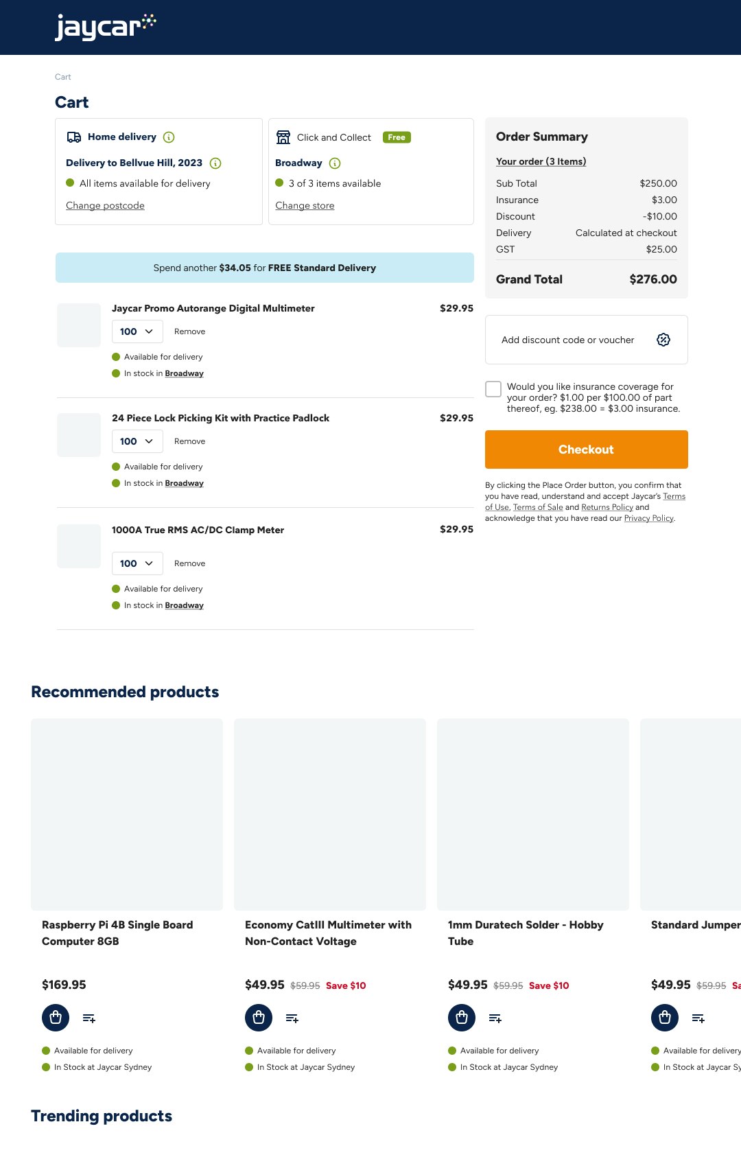
- A sharp increase in cart abandonment
- Lower engagement on product pages
- Confusing navigation and inconsistent UI components
- Negative feedback from both internal teams and customers
- The business needed a fast but thorough analysis to uncover actionable UX issues that were directly impacting revenue and customer trust.
Closer look at the problem
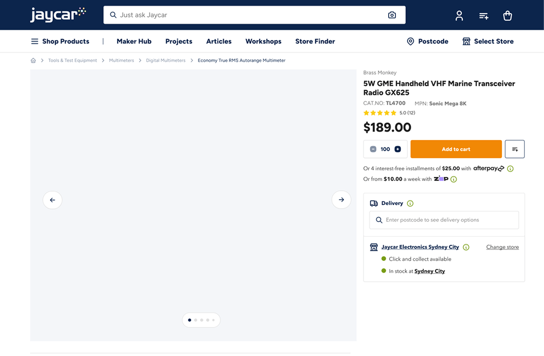
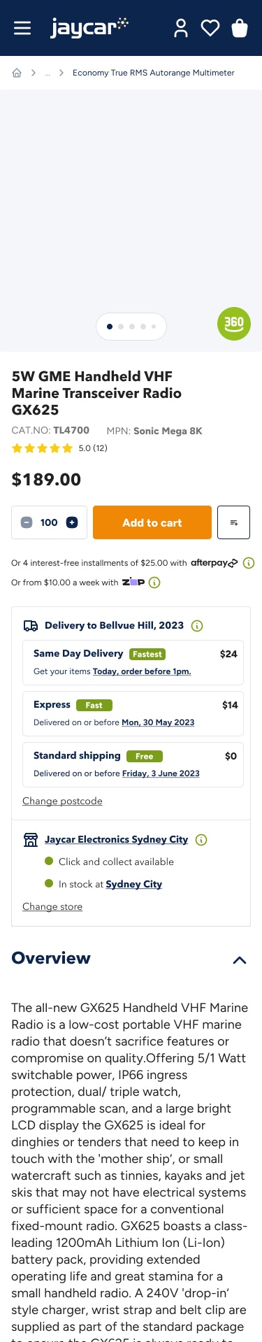
- Poor navigation architecture: Customers struggled to locate products due to nested menus and inconsistent filtering options, which created friction early in the journey.
- Product page overload: Product pages were overloaded with technical data without clear hierarchy, leaving casual or first-time users overwhelmed and unsure.
- Checkout disruptions: Several error messages during checkout, including unnecessary delivery disclaimers, created uncertainty and reduced conversion rates.
- Visual inconsistencies: While the new design looked modern, there were numerous inconsistencies across components, buttons, font styles, and iconography which made the experience feel unpolished and unreliable.
The solution
After presenting my findings and prioritised recommendations, the internal team began immediate implementation of:
- A simplified and more intuitive navigation system
- Streamlined product cards with clearer CTAs and visual hierarchy
- Removal or rewording of conversion-killing error messages
- A more cohesive design system across devices
**